


Web design is much like art, reflecting the spirit of its time. In 2026, the shift is clear. What felt experimental last year is now the expectation. Staying ahead of the top web design trends means understanding what users truly want. Experiences that are faster, smarter, more human, and more intentional. These are the forces shaping the web right now, and the ones every design and engineering team needs to know.
1. MICRO-INTERACTIONS

Micro-interactions like small animated responses to user actions like button hovers, form completions, and scroll triggers are not new. But in 2026, they've grown up. Where they once existed for delight, they now serve clarity. The best micro-interactions guide users through complex interfaces, reduce errors, and create a sense of responsiveness that users associate with quality.
The rule in 2026 is purposeful over decorative. If a micro-interaction doesn't serve the user's understanding or confidence, it probably doesn't belong. The brands getting this right are the ones whose interfaces feel intuitive without the user knowing why. If a micro-interaction doesn't serve clarity, it's just noise.
2. KINETIC TYPOGRAPHY
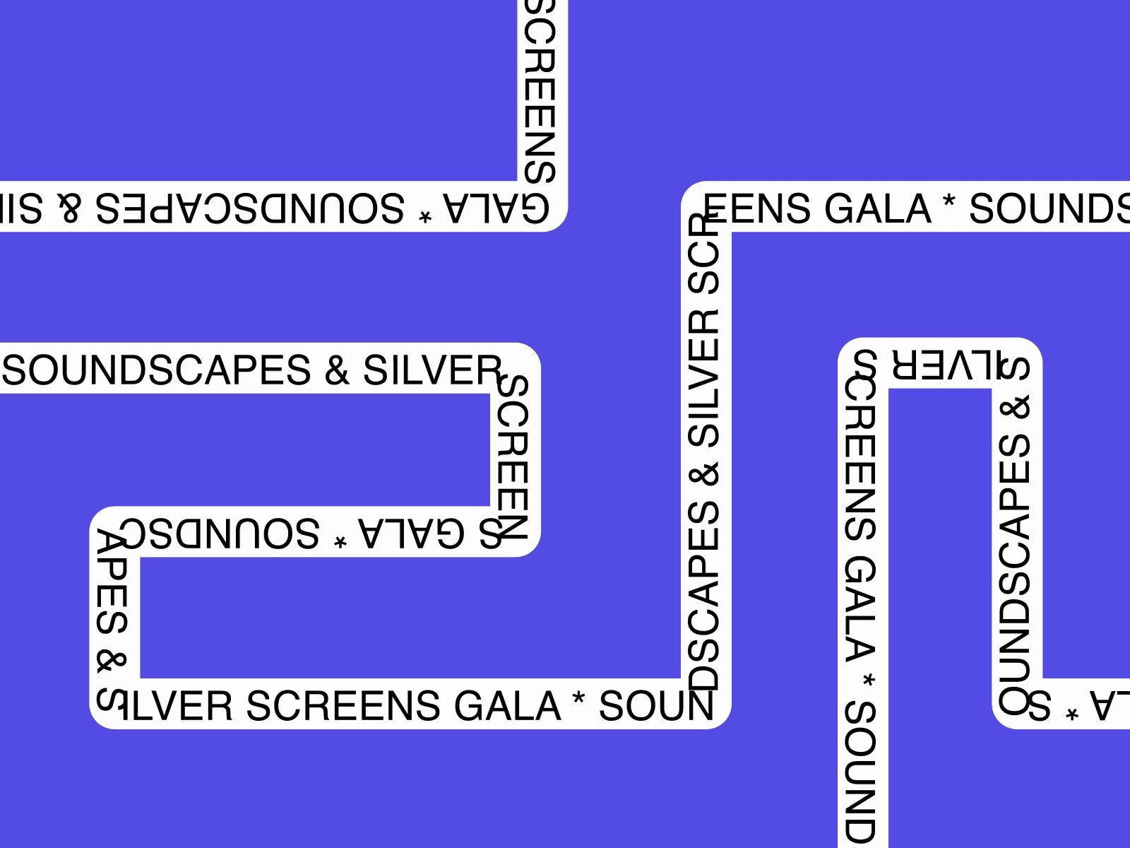
Typography has stepped out of the background and into the spotlight. In 2026, type doesn't just communicate, it moves, reacts, and tells the story. Oversized headlines that reveal on scroll, words that morph as you navigate, and variable fonts that shift in weight based on user interaction are defining how brands make their first impression.
This isn't animation for its own sake. When done well, kinetic typography guides attention, reinforces brand voice, and makes copy feel alive. It's especially powerful for hero sections where you have seconds to stop a visitor from scrolling past. Typography in 2026 is no longer passive. It's the visual hero of the page.
3. COLOR TRENDS

Color in 2026 is moving in two very different directions at once, and both are winning, depending on the brand.
The first is earthy and muted. Pantone's Color of the Year 2026 is Cloud Dancer: a soft, warm white. Soil, clay, wood. Palettes that feel grounded, human, and calm. Brands using this direction communicate authenticity, sustainability, and warmth.
The second is dopamine design. Neon gradients, Y2K brights, high-contrast pairings. Saturated color that demands attention and signals energy. Beauty, lifestyle, and youth-focused brands are leading this direction. The question in 2026 isn't which palette is trending; it’s which one fits your brand's story?
4. DARK MODE AND ACCESSIBILITY

Dark mode is no longer a trend; it's a user preference that every serious website should accommodate. Most users now expect the option to switch, and many devices automatically default to dark mode. Sites that don't offer it are already behind.
Similarly, accessibility has moved from afterthought to foundation. High-contrast color schemes, keyboard navigation, screen reader support, and voice control are no longer features; they're the baseline. As regulations tighten and user expectations rise, designing accessibility from day one isn't just the right thing to do. It's the only way to build something that works for everyone. In 2026, accessibility-first isn't a philosophy. It's the minimum viable standard.
5. INTERACTIVE 3D ELEMENTS

Interactive 3D has crossed from impressive to expected. In 2026, WebGL, Three.js, and tools like Spline have made it possible for any well-resourced team to integrate photorealistic 3D models, scroll-triggered animations, and AR previews directly into a website without sacrificing load performance.
For product-led companies and e-commerce brands, this is no longer a nice-to-have. Nike lets users rotate shoes. IKEA lets you place furniture in your room. When a user can interact with your product before they buy it, conversion improves. 3D is a sales tool now, not a visual flourish. 3D elements in 2026 solve comprehension problems. They're not there to impress; they're there to convert.
6. GLASSMORPHISM
Glassmorphism is back, and this time, it's earned its place. The frosted-glass aesthetic (translucent panels, blurred backgrounds, soft, layered shadows) had its moment in the early 2020s before being dismissed as a Dribbble trend that didn't hold up in real projects. In 2026, it will be significantly more mature.
Apple's Liquid Glass design system gave it credibility as a functional UI pattern, not just decoration, but a way to communicate depth and hierarchy. Modern implementations are subtle, purposeful, and performance-aware. You'll see it in cards, navigation bars, and UI moments that need to feel layered and premium without adding visual noise. The 2026 version of glassmorphism communicates depth. It doesn't just look good, it does a job.
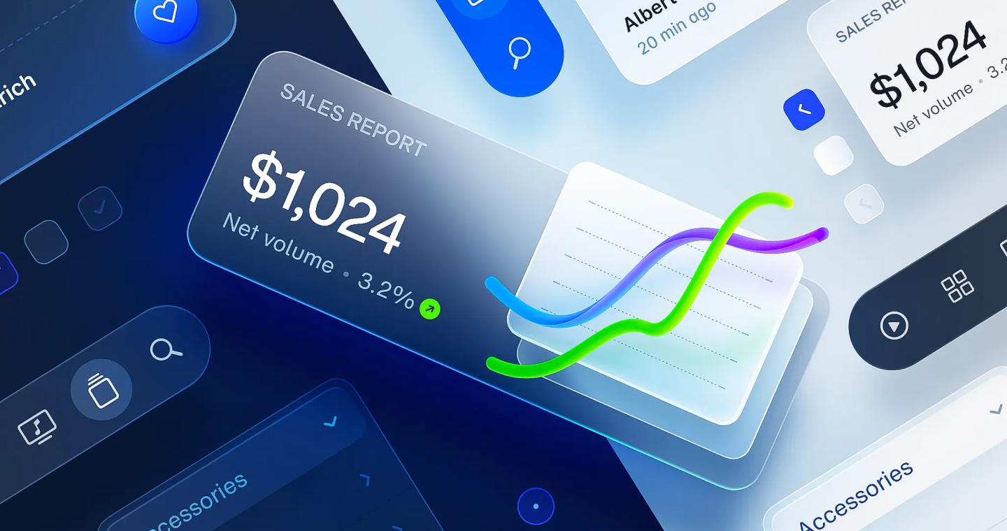
7. BENTO GRID LAYOUTS
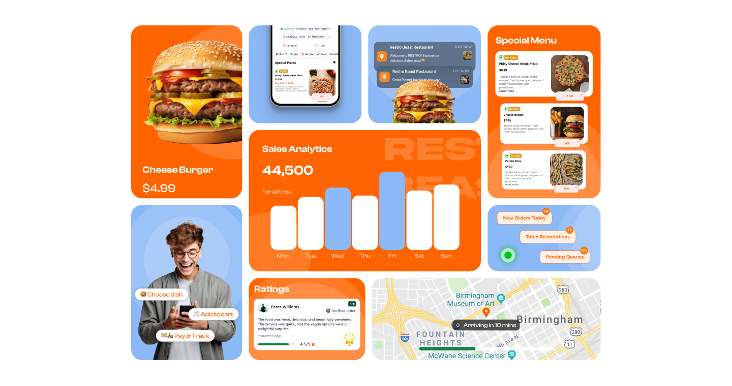
Named after the Japanese lunch box, bento grid layouts organize content into modular, card-based systems of varying sizes, all aligned to a clean grid structure. Apple popularised this pattern in product pages and keynotes. In 2026, it has spread across SaaS, portfolios, dashboards, and landing pages.
The reason is practical. Bento grids let you present dense information in a way that feels both organized and dynamic. They're highly scannable, work beautifully across screen sizes, and give designers flexibility to create visual hierarchy without overwhelming the user. Bento grids do what good design always does: they make complex information feel simple.
8. ORGANIC AND ANTI-GRID LAYOUTS
.png)
After a decade of rigid grid systems, designers in 2026 are deliberately breaking the rules. Organic layouts, such as fluid shapes, flowing lines, soft gradients, and intentional asymmetry, create a sense of movement, warmth, and personality that rigid structures can't replicate.
This trend reflects something deeper: as the web becomes more automated and AI-generated, users crave digital spaces that feel human. Organic layouts signal that a brand has a point of view and the confidence to express it in different ways. They work especially well for creative, lifestyle, and sustainability-focused brands. Organic design in 2026 is a response to algorithmic sameness. It says: this was made with intention.
9. SUSTAINABLE WEB DESIGN

Sustainable design has moved from niche to norm. In 2026, the environmental footprint of a website is through lean code, optimized assets, faster load times, and green hosting, and this is part of every serious design and engineering brief.
Performance and sustainability are the same conversation. A bloated website isn't just slow, it's wasteful. And with Google's Core Web Vitals directly impacting search rankings, there's a business case as much as an ethical one. The most forward-thinking teams are treating page weight and load time as design constraints, not afterthoughts. A fast website is a sustainable website. In 2026, performance is the design decision.
CONCLUSION
In conclusion, as we look ahead through 2026, UPDOT® is excited to embrace the evolving trends in web design. There is a growing focus on personalization, engagement, and functionality.
We are dedicated to staying at the forefront of these trends, ensuring that the websites we build are not only visually stunning but also highly functional and future-ready.
The digital landscape is constantly shifting, and with each new trend comes an opportunity to create experiences that are more immersive, more human, and more impactful than ever before. If you’re ready to bring such trends to life on your website, get in touch with us. We’ll take a look at what you’re working with and help you build something that truly stands out.

